Design and Develop an Android App with React Native and Publish to Google Play Store
Heads up... this blog post is old!
For an updated version of this blog post, see Create a React Native App with Login in 10 Minutes.

As mobile app usage is expected to continue to grow, now is as good a time as any to get into the market. Android is by far the most popular OS worldwide and the dominant way to get Android apps to phone users is the Google Play Store. In this tutorial, you’ll build a React Native app and I’ll walk you through everything from how to pick a design, as well as setting up your React Native environment, tips for getting the most out of your editor, and publishing it on Google Play.
This is what the eventual app will look like:
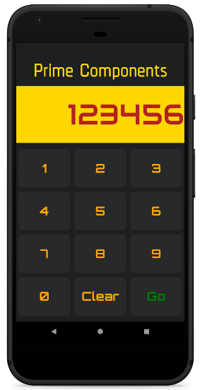
For this tutorial, I checked out Karan Goel’s Mega Project List for project inspiration. You’ll be building the Prime Factorization problem which takes a number and returns its prime factors.
Note: In May 2025, the Okta Integrator Free Plan replaced Okta Developer Edition Accounts, and the Okta CLI was deprecated.
We preserved this post for reference, but the instructions no longer work exactly as written. Replace the Okta CLI commands by manually configuring Okta following the instructions in our Developer Documentation.
Determine Interface Theming for Your React Native App
Outside of application logic, UI and theming decisions are some of the most important that you’ll make for your app This includes the controls like dropdowns and buttons, as well as the layout on the screen. Since we are using a React-based technology, we’re going to use Styled Components which is a popular, light-weight approach to theming React applications (and it also works great on React Native). There’s an entire page listing components and component-systems based on Styled Components. In this tutorial, you’ll be using Styled Components to build up components yourself.
Set Up Your Android Production Environment
In order to build the eventual APK (the format of the app you’ll upload to the store), you need to install Android Studio. Once done make sure you have SDK version 27 as this is what React Native uses.
Install the JDK
You also need to make sure you have a recent Java Development Kit installed (like version 8). The installation differs depending on your platform. You can use Oracle’s Java SDK or use SDKMAN to install other options, like OpenJDK.
Add the React Native CLI and Initialize the Skeleton
Next, you should install the React Native Command Line Interface. For this, you should make sure you have Node installed which varies depending on your operating system. (I am using version 8.12.0).
npm install -g react-native-cli@2.0.1
You should have a command react-native available to you, which includes the init option.
react-native init prime_components
This will create the prime_components directory and put a React Native project inside, with a runnable skeleton. Change to the directory, connect your Android phone or run an emulator (after having installed Android Studio), and run the project.
NOTE: If Android Studio prompts you to open a project before you can create an emulator, you can point to the prime_components/android directory.
cd prime_components
react-native run-android
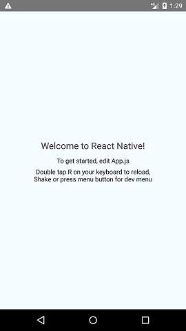
To see the output you’ll upload to the Play Store, go to android/app/build/outputs/apk/debug. You should see an app-debug.apk that is around 8MB in size.
Reduce the Output Size of Your Android App
You want to make sure your users have the smallest download possible. It’s already quite small (around 8MB) because you’re using the command line (something like Expo produces 25MB for even basic apps) but we can [reduce it further]https://medium.com/@aswinmohanme/how-i-reduced-the-size-of-my-react-native-app-by-86-27be72bba640). Go to android/app/build.gradle and change the following variables to be true:
def enableSeparateBuildPerCPUArchitecture = true
def enableProguardInReleaseBuilds = true
You’ll also have to remove the ndk section of defaultConfig to removing the conflicting configuration in ndk abiFilters error:
ndk {
    abiFilters "armeabi-v7a", "x86"
}
Now after re-running react-native run-android you should see two (much smaller - between 4MB and 5MB) APKs in the output directory.
Add Linting to Your React Native App
Writing any JavaScript (like React) requires tools to ensure you haven’t made any obvious mistakes which can be a big help for beginners. The most common of these is ESLint which can be plugged right into your project and editor.
First, add the linter using NPM:
npm install -D eslint@5.9.0 babel-eslint@10.0.1
One common set of plugins is Airbnb’s configuration so add those too:
npm install -D eslint-config-airbnb@17.1.0 eslint-plugin-jsx-a11y@6.1.2 eslint-plugin-react@7.11.1 eslint-plugin-import@2.14.0
Now put the following into .eslintrc.js (you’ll need to create this file):
module.exports = {
  'extends': 'airbnb',
  'parser': 'babel-eslint',
  'env': {
    'jest': true,
  },
  'rules': {
    'no-use-before-define': 'off',
    'react/jsx-filename-extension': 'off',
    'react/prop-types': 'off',
    'comma-dangle': 'off'
  },
  'globals': {
    "fetch": false
  }
}
Now you just need to add the plugins to your editor. For Sublime there’s ESLint which gives you an output of errors (or issues) with CTRL + ALT + e (Cmd + Option + e on Mac). There also one for VSCode.
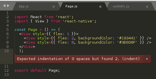
A lot of these errors can be fixed automatically using the eslint --fix command which you can run from your editor with the ESLint Fix package.
Add Styled Components for React Native
React and React Native build interfaces using web technologies, i.e. HTML, CSS, and JavaScript. One very popular library to use with React (and React Native) is Styled Components which clean up how one adds CSS to your components.
For example, take a look at the following code, taken from the React Native sample app (which is what you get with react-init):
export default class App extends Component<Props> {
  render() {
    return (
      <View style={styles.container}>
      <Text style={styles.welcome}>Welcome to React Native!</Text>
      <Text style={styles.instructions}>To get started, edit App.js</Text>
      <Text style={styles.instructions}>{instructions}</Text>
    </View>
  );
  }
}

const styles = StyleSheet.create({
  container: {
    flex: 1,
    justifyContent: 'center',
    alignItems: 'center',
    backgroundColor: '#F5FCFF',
  },
  welcome: {
    fontSize: 20,
    textAlign: 'center',
    margin: 10,
  },
  instructions: {
    textAlign: 'center',
    color: '#333333',
    marginBottom: 5,
  },
});
You declare your DOM elements (View, Text), linking them to styles, and then create the stylesheet later.
With Styled Components you would do the following:
const Container = styled.View`
  flex: 1;
  justify-content: center;
  align-items: center;
  background-color: #F5FCFF;
`;

const Welcome = styled.Text`
  fontSize: 20;
  text-align: center;
  margin: 10;
`;

const Instructions = styled.Text`
  text-align: center;
  color: #333333;
  margin-bottom: 5;
`;

export default class App extends Component<Props> {
  render() {
    return (
      <Container>
        <Welcome>Welcome to React Native!</Welcome>
        <Instructions>To get started, edit App.js</Instructions>
      </Container>
  );
  }
}
It’s both cleaner and more portable (CSS names don’t clash, etc.).
To install it, run npm install styled-components@4.1.1 from the root directory.
Add Custom Fonts to Your React Native App
To get a custom font like Racing Sans One into your application you first need to download the ttf and put it into assets/fonts (you will need to create this directory). Then add the following to your package.json:
"rnpm": {
  "assets": [
    "./assets/fonts/"
  ]
}
Finally run react-native link from the command line. You should now see your font inside of android/app/src/main/assets/fonts. You should be able to use it now. Create a components folder and put the following inside of components/Header.js:
import styled from 'styled-components/native';

export default styled.Text`
  color: black;
  font-family: RacingSansOne-Regular;
  font-size: 32px;
  margin-top: 120px;
  background-color: transparent;
  text-align: center;
`;
Then, import this into your App.js and add <Heading>Welcome</Heading> above the Text nodes:
import Header from './components/Header';
...
export default class App extends Component<Props> {
  render() {
    return (
      <View style={styles.container}>
        <Header>Welcome</Header>
        <Text style={styles.welcome}>Welcome to React Native!</Text>
        <Text style={styles.instructions}>To get started, edit App.js</Text>
        <Text style={styles.instructions}>{instructions}</Text>
      </View>
    );
  }
}
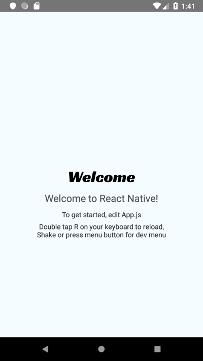
And you should get a nicely formatted header:
Adjust Your App to be Fullscreen on Android
To get your app to not show the title bar, go to android/app/src/main/res/values/styled.xml and add the following inside the <styles> element:
<item name="android:windowFullscreen">true</item>
Now when you re-run you should see the navigation bar is gone.
Create the Android App Components
It can take a long time to decide on a final design, with layout, colors, and fonts. This is often an iterative process. Here you’ll go through how to build up the final result you saw at the start - which was inspired by related online tutorials and styling examples - but remember that it takes time to get to something you like.
Change App.js to the following:
import React from 'react';
import { Container, Header, Input, Keypad, ButtonRow } from './components';

const App = () => (
  <Container>
    <Header>Prime Components</Header>
    <Input>123456</Input>
    <Keypad>
      <ButtonRow keys={['1','2','3']} />
      <ButtonRow keys={['4','5','6']} />
      <ButtonRow keys={['7','8','9']} />
      <ButtonRow keys={['0','Clear','Go']} />
    </Keypad>
  </Container>
);

export default App;
You can see here how clean things are with Styled Components. We have a header, an input and a keypad (all names you choose) all surrounded by a container. No superfluous information. The styling happens in the components.
Create the components directory. Inside components/index.js put the following:
export { default as Input } from './Input';
export { default as Container } from './Container';
export { default as Header } from './Header';
export { default as Keypad } from './Keypad';
export { default as Button } from './Button';
export { default as ButtonRow } from './ButtonRow';
This is just a convenience module that allows for the importing as in App.js, i.e. `
import { Container, Header, Input, Keypad, ButtonRow } from ‘./components’;`. Otherwise, you’d have to import each component on a separate line.
Put this into components/Container.js: (Note: you must use capital letters for your components in React Native!)
import styled from 'styled-components/native';

export default Container = styled.View`
  flex: 1;
`;
Very simple: you are extending a View component and assigning a flex value of one (which in this context means “take up everything”).
components/Header.js:
import styled from 'styled-components/native';

export default Header = styled.Text`
  flex: 1.5;
  font-size: 80px;
  font-family: Chathura-ExtraBold;
  background-color: rgb(29, 31, 33);
  color: gold;
  text-align: center;
`;
Also, a styled text component, with large, centered fonts, a gold color, and grey background. Make sure you install the Chathura font from Google Fonts as before!
components/Input.js:
import styled from 'styled-components/native';

export default Input = styled.Text`
  flex: 2;
  text-align: right;
  font-family: Audiowide-Regular;
  text-align-vertical: center;
  font-size: 70;
  color: firebrick;
  background-color: gold;
`;
Similar to before except now with the Audiowide-Regular font (also available from Google Fonts).
components/Keypad.js:
import styled from 'styled-components/native';

export default Keypad = styled.View`
  flex: 6;
  background-color: rgb(29, 31, 33);
  padding-top: 10px;
  padding-bottom: 10px;
`;
Also just a styled view (essentially a container like a <div> in HTML).
components/ButtonRow.js:
import React from 'react';
import styled from 'styled-components/native';
import { Button } from '.';

const RowBox = styled.View`
  flex: 1;
  flex-direction: row;
`;

export default ButtonRow = ({keys}) => (
  <RowBox>
    { /* https://stackoverflow.com/a/32157488 */ }
    {keys.map(key => (
      <Button text={key} key={key} />
    ))}
  </RowBox>
);
Here, things get complicated. You are importing a Button from the current directory (which you’ll create in a second), creating a component called RowBox which is not exported, and then ButtonRow is defined having a React property called keys.
Then you are mapping each key to a button component. This is a clean way of looping through an array as with for each and using the value to set both the text and key attributes (you must set a key attribute to make the DOM object unique!). You’ll be using the text to render the button.
components/Button.js:
import React from 'react';
import styled from 'styled-components/native';

/* https://kylewbanks.com/blog/react-native-tutorial-part-2-designing-a-calculator */

/* https://github.com/styled-components/styled-components/issues/149 */
const ButtonBox = styled.TouchableHighlight.attrs({
  underlayColor: '#193441',
})`
  flex: 1;
  align-items: center;
  justify-content: center;
  background-color: rgb(39, 41, 43);
  border-radius: 10px;
  margin: 5px;
`;

const ButtonText = styled.Text`
  font-size: 30;
  font-family: Orbitron-Bold;
  color: ${props => props.text=="Go" ? "green" : "orange"};
`;

handleButtonPress = (value) => {

};

export default Button = ({text}) => (
  <ButtonBox onPress={() => handleButtonPress()}>
    <ButtonText text={text}>{text}</ButtonText>
  </ButtonBox>
);
This is the last component. You start by creating a ButtonBox which just acts as a container over the whole button. It is using TouchableHighlight which is a React Native component that will change color when touched. The styling is normal except for the underlay color (the color you see when touching) since this needs to be hacked to work in Styled Components.
Next, you have ButtonText which is a text control. Install Orbitron-Bold from Google Fonts for this. The color is set using a boolean check (another great feature of Styled Components, full-CSS support). Essentially the color will be green if the text is “Go”, and orange otherwise.
Next, define a function to handle button presses (empty for now), and then export the Button component that combines the two. Set the text attribute on ButtonText using the property set on Button so that Styled Components can see it when you set the styles.
Once done, you should see the app render as you saw at the top of this article.
Add Colors to Your Android App
The colors in the Android Emulator may not always match once you’re viewing it on an actual phone. This is because Android Oreo fixed color management to ensure things looked the same across devices. If you’re having similar issues, see if you are using Android 7 or before.
You could restrict your users to Android 8 or above, but right now that’s only about 20% of Android users so probably best just to put a message somewhere that things look a bit better on later versions.
Wire Up Your Buttons in React
That is it for the basic design and layout. Now you need to connect the buttons so they actually do something. To start, you need to make pressing the numbers (and clear key) add and remove numbers from the number display.
For this, you need to understand state in React.
Lifting Up State
We need a single source of truth for the current number (to be displayed) and the callback function that will modify it. It has to be a parent of both (the Input and the Button). Since this is part of the app you can put this into the App component in App.js.
Start by modifying App.js and converting it to a React class (from the current functional definition) since you need this to capture state.
import React from 'react';
import { Container, Header, Input, Keypad, ButtonRow } from './components';

class App extends React.Component {
  render() {
    return (
      <Container>
        <Header>Prime Components</Header>
        <Input>123456</Input>
        <Keypad>
          <ButtonRow keys={['1','2','3']} />
          <ButtonRow keys={['4','5','6']} />
          <ButtonRow keys={['7','8','9']} />
          <ButtonRow keys={['0','Clear','Go']} />
        </Keypad>
      </Container>
    );
  }
}

export default App;
App is now a JavaScript ES6 class, and it has a render() method which returns the JSX.
Reload the emulator/app (in the emulator you can use R+R) and it should still render as before.
Now add the following above your render() method:
constructor(props) {
  super(props);
  this.state = {number:123456};
}
You are overriding the React constructor, calling the parent (which you always must) and then setting the state to a JSON object with one member: number (which we’ve initialized to our old value: 123456).
Now add this above the return(...) in App.js:
const { state } = this;
This destructures the state from this into a local variable. Change the <Input> line to <Input>{state.number}</Input>. Now the input is being rendered from the state. Reload and you should see the same output (and change the state constructor to see it changing).
Modifying State in React
Now, you need to tell each button to call a function defined in your App class. Add the following to the constructor:
this.press = this.press.bind(this);
This will make the press function have access to this (which is needed when you called this.setState).
Next, define a press function which just alerts which button was pressed.
press = (value) => {
  alert(value);
};
Now pass this function to your button rows:
<ButtonRow func={this.press} keys={['1','2','3']} />
<ButtonRow func={this.press} keys={['4','5','6']} />
<ButtonRow func={this.press} keys={['7','8','9']} />
<ButtonRow func={this.press} keys={['0','Clear','Go']} />
Modify ButtonRow to take in this value and pass it to the created Buttons.
export default ButtonRow = ({func,keys}) => (
  <RowBox>
    {keys.map(key => (
      <Button func={func} text={key} key={key} />
    ))}
  </RowBox>
);
Finally, change Button to take in this function and call it with the pressed button. You can also remove the previous button handler.
export default Button = ({func,text}) => (
  <ButtonBox onPress={() => func(text)}>
	<ButtonText text={text}>{text}</ButtonText>
  </ButtonBox>
);
Now when you press a button you should see an alert with what you pressed:
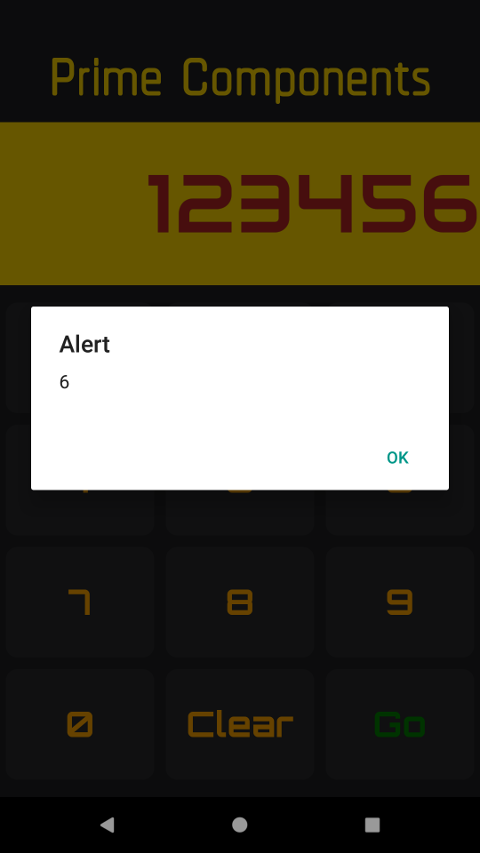
You now have a single function, defined at the top, which controls what buttons do.
Use Class Properties Correctly in React
To clean things up a bit you can use class properties to initialize state in React. Simply take out the constructor and replace it with this:
state = {
  number: 123456
};
Update Your React Native App Display
As number buttons are pressed, you need to add said number to the current number. Also, when Clear is pressed you have to delete. Do that first. Change press() to the following:
press = (value) => {
  let { number } = this.state;
  if (value === 'Clear') {
    number = Math.floor(number / 10);
    this.setState({ number });
  }
}
First, this pulls out the value of the number from the state using destructuring (using your linter previously you’ll see it is preferred). Then if the key is Clear, divide the number by ten, floor it (i.e. remove the last digit), and then set the state. That should be enough to make the clear button work.
Now add the following to the if statement in press():
else if (value != 'Go' && number<1000000) {
  number += value;
  this.setState({ number });
}
So if Go hasn’t been pressed and the value is less than one million (you have to stop somewhere - phones aren’t that fast), add the value to the back (interpreting it as a string instead of integer) and again, set the state. That should make every button work.
The only thing left to do is the Go button.
Add Screens to Your Android App
When the Go button is pressed you want to hide the keypad and show a progress screen. For this you need another state variable, a boolean, so add it to the state class property, i.e.
state = {
  number: 123456,
  processing: false
};
Also add a check for Go in the press function:
else if (value === 'Go') {
  this.setState({ processing: true });
}
Then create components/Processing.js:
import React from 'react';
import styled from 'styled-components/native';

const ProcessingBox = styled.Text`
  flex: 6;
  font-size: 30;
  text-align: center;
  text-align-vertical: center;
  font-family: Orbitron-Bold;
  color: red;
  background-color: rgb(29, 31, 33);
  padding-top: 10px;
  padding-bottom: 10px;
`;

export default () => (
  <ProcessingBox>Processing</ProcessingBox>
);
Add it to your components/index.js:
export { default as Processing } from './Processing';
Then import it at the top of your App.js:
import { Container, Header, Input, Keypad, ButtonRow, Processing } from './components';
And use the processing boolean to decide whether to render it or the keypad:
{state.processing ? (
  <Processing />
) : (
  <Keypad>
    <ButtonRow func={this.press} keys={['1', '2', '3']} />
    <ButtonRow func={this.press} keys={['4', '5', '6']} />
    <ButtonRow func={this.press} keys={['7', '8', '9']} />
    <ButtonRow func={this.press} keys={['0', 'Clear', 'Go']} />
  </Keypad>
)}
This checks if state.processing is true and if so, show the processing. Otherwise, show the keypad.
Calculate Prime Factors
The simplest way to break a number down into prime factors is looping through all numbers from 2 to num/2 (since anything greater than num/2 won’t be a factor) and check if it divides. However, what about number 4? It is not prime. So we should also check if each factor is prime.
A clever algorithm is described here. Start with 2 - keep dividing num by 2 and for each case add 2 to the list until it won’t divide anymore.
while (num%2 == 0) {
  addFactor(2);
  num = num/2;
}
Now num will be odd. Start the same process from 3 except only go until the square root of num, incrementing by 2 (only odd numbers):
for (int i = 3; i <= Math.floor(Math.sqrt(num)); i += 2) {
  while (num%i == 0) {
    add_factor(i);
    num = num/i;
  }
}
Note you have to use floor in JavaScript when dealing with things like square root because all numbers in JavaScript are floats (actually doubles).
So similarly, keep adding the divisor as a factor until there is no more remainder left.
The last step is to check if the number you have left is great than 1. If so, it must be prime!
if (num > 1) { add_factor(num); }
You’ll be putting this all together shortly.
Now that you have the code you need to display the results.
Display Lists in React Native
To display lists you need to use a React Native list view, in our cast, a FlatList. This takes a list of values (objects) called data and a way to render each item called renderItem.
<FlatList
  data={[{key: 'a'}, {key: 'b'}]}
  renderItem={({item}) => <Text>{item.key}</Text>}
/>
Change components/Processing.js to the following:
import React from 'react';
import { FlatList } from 'react-native';
import styled from 'styled-components/native';

const ProcessingBox = styled.View`
  flex: 6;
  background-color: rgb(29, 31, 33);
  padding-top: 10px;
  padding-bottom: 10px;
`;

const Header = styled.Text`
  font-size: 30;
  text-align: center;
  text-align-vertical: center;
  font-family: Orbitron-Bold;
  color: red;
  padding-top: 10px;
`;

const Item = styled.Text`
  font-size: 20;
  text-align: center;
  text-align-vertical: center;
  font-family: Audiowide-Regular;
  color: firebrick;
`;

export default () => (
  <ProcessingBox>
    <Header>Processing</Header>
    <FlatList
      data={[{ key: '2' }, { key: '2' }, { key: '3' }, { key: '5' }]}
      renderItem={({ item }) => <Item>{item.key}</Item>}
    />
  </ProcessingBox>
);
So you have a ProcessingBox, a Header and an Item which are combined in the export. You should see the following when you click Go:
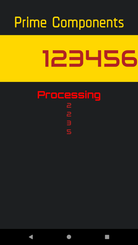
Pulling Your React Native App Together
To make this work with the app you need to control the rendering from outside, so change the render method to the following:
export default ({ running, factors, press }) => (
  <ProcessingBox>
    {running ? (
      <Header>Processing</Header>
    ) : (
      <Header>Finished</Header>
    )}
    <List
      data={factors}
      renderItem={({ item }) => <Item>{item.key}</Item>}
    />
    {!running && (
      <Button func={() => press('Back')} text="Back" />
    )}
  </ProcessingBox>
);
Here the control takes in three variables, which control which header is shown, the prime factors being displayed, and the function used to switch the parent state (the same function used when buttons are pressed), respectively.
FlatList has been replaced with List which is just a styled component to control the size of the list rendering. Add the following to Processing.js:
const List = styled.FlatList`
  flex: 5;
`;
There is also a Button which is your own control. Import it with import { Button } from '.';.
Now move on to App.js and change the <Processing /> tag in render() to:
<Processing running={state.running} factors={state.factors} press={this.press} />
So you’re passing the three parameters just discussed, the first two from the state. Now change the state property to include these new values:
state = {
  number: 123456,
  factors: [],
  processing: false,
  running: false
};
Now below this, in the App class, put the function for calculating primes:
getPrimes = (N) => {
  const factors = [];
  let num = N;
  while (num % 2 === 0) {
    factors.push({ key: '2' });
    num /= 2;
  }
  let i; for (i = 3; i <= Math.floor(Math.sqrt(num)); i += 2) {
    while (num % i === 0) {
      factors.push({ key: `${i}` });
      num /= i;
    }
  }
  if (num > 1) { factors.push({ key: `${num}` }); }
  return factors;
};
Finally, change the press function to get these factors and set the state using them (as well as respond correctly to the Back button in the processing screen:
press = (value) => {
  let { number } = this.state;
  if (value === 'Clear') {
    number = Math.floor(number / 10);
    this.setState({ number });
  } else if (value !== 'Go' && value !== 'Back' && number < 1000000) {
    if (number === 0) number = value; else number += value;
    this.setState({ number });
  } else if (value === 'Go') {
    this.setState({ processing: true });
    let factors = this.getPrimes(number);
    this.setState({ running: false });
    this.setState({ factors });
  } else if (value === 'Back') {
    this.setState({ processing: false });
  }
};
Now when you run the app and press Go you should see a list of the prime factors, as well as a Back button which will take you back.
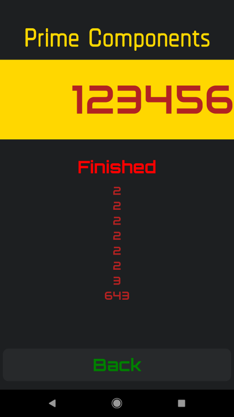
Editing the number and re-clicking Go should get a new list of factors. Congrats, you’ve finished the app!
Set Your Android App Name and Icon
To make things look good once deployed on the phone you need to set the name and icon. You can set the name in android/app/src/main/res/values/strings.xml:
<resources>
    <string name="app_name">Prime Components</string>
</resources>
For the icon, it’s best to open your project in Android Studio (use the android directory) and create a ‘drawable’ directory in assets. Then right-click and say New -> Image Asset. This will let you import your large icon and overwrite ic_launcher which is what is used for the launcher icon, generating all the versions you need for the Play Store. Re-deploy with react-native run-android and you should see a proper name and icon on your apps list.
If you get a bundling issue next time you run react-native run-android when running on Android there is a Stack Overflow fix that works.
Add Authentication with AppAuth
Authentication may not be mission-critical to a calculator, but it’s often wise to add while your app’s features remain simple. As you add features you may want to give users the option to save a calculation history or share their work with friends. These features will require the kind of secure user management Okta makes simple.
First add a new Login.js component by copying Button.js and changing the font size to 20, the border radius and margin to zero, and the background color to something lighter like rgb(49, 51, 53).
import React from 'react';
import styled from 'styled-components/native';

const ButtonBox = styled.TouchableHighlight.attrs({
  underlayColor: '#193441',
})`
  flex: 1;
  align-items: center;
  justify-content: center;
  background-color: rgb(49, 51, 53);
  border-radius: 0;
  margin: 0;
`;

const ButtonText = styled.Text`
  font-size: 20;
  font-family: Orbitron-Bold;
  color: orange;
`;

export default Login = ({func,text}) => (
  <ButtonBox onPress={() => func(text)}>
    <ButtonText text={text}>{text}</ButtonText>
  </ButtonBox>
);
Add it to index.js in the components directory, import it at the top of App.js and add loggedin: false to the App class state. Finally, below the <Input> control in render put a switch to determine what to print on the login button:
    {state.loggedin ? (
      <Login text="Logout" />
    ) : (
      <Login text="Login" />
    )}
When you re-run the project you should see a new login button.
Note: if you are not seeing any changes from your code reflected in the react-native run-android deploy it might be because you removed internet permissions in your AndroidManifest.xml which React Native uses to connect the app with your development machine. Simply replace it above the application directive:
<uses-permission android:name="android.permission.INTERNET" />
Before you begin, you’ll need a free Okta developer account. Install the Okta CLI and run okta register to sign up for a new account. If you already have an account, run okta login.
Then, run okta apps create. Select the default app name, or change it as you see fit.
Choose Native and press Enter.
Use com.okta.dev-133337:/callback for the Redirect URI and the Logout Redirect URI
(where dev-133337.okta.com is your Okta domain name). Your domain name is reversed to provide a unique scheme to open your app on a device.
What does the Okta CLI do?
The Okta CLI will create an OIDC Native App in your Okta Org. It will add the redirect URIs you specified and grant access to the Everyone group. You will see output like the following when it’s finished:
Okta application configuration:
Issuer:    https://dev-133337.okta.com/oauth2/default
Client ID: 0oab8eb55Kb9jdMIr5d6
NOTE: You can also use the Okta Admin Console to create your app. See Create a Native App for more information.
Now install react-native-app-auth and link it.
react-native install react-native-app-auth@4.0.0
react-native link react-native-app-auth
Now add the following to the defaultConfig section of the android config in android/app/build.gradle, using the base of your Redirect URL, e.g. com.okta.dev-133337.
defaultConfig {
    applicationId "com.prime_components"
    ...
    manifestPlaceholders = [
        appAuthRedirectScheme: "{redirectBase}"
    ]
}
At the top of your App.js import Alert from the React Native package and authorize and revoke from the App Auth package:
import { Alert } from 'react-native';
import { authorize, revoke } from 'react-native-app-auth';
Before you define your App class, add a config variable with the details of your Okta app:
const config = {
  issuer: 'https://{yourOktaDomain}/oauth2/default',
  clientId: '{clientId}',
  redirectUrl: '{redirectUrl}',
  additionalParameters: {},
  scopes: ['openid', 'profile', 'email', 'offline_access']
};
Now add accessToken: '' to your state initialization and add the following two functions to your App class:
  state = {
    ...
    accessToken: '',
  };

...

authorize = async () => {
  try {
    const authState = await authorize(config);

    this.setState({
      loggedin: true,
      accessToken: authState.accessToken
    });
  } catch (error) {
    Alert.alert('Failed to log in', error.message);
  }
};

revoke = async () => {
  try {
    const { state } = this;
    await revoke(config, {
      tokenToRevoke: state.accessToken,
      sendClientId: true
    });
    this.setState({
      accessToken: '',
      loggedin: false
    });
  } catch (error) {
    Alert.alert('Failed to revoke token', error.message);
  }
};
Finally add func={this.authorize} as an attribute on your login button and func={this.revoke} to your logout button.
{state.loggedin ? (
  <Login text="Logout" func={this.revoke}/>
) : (
  <Login text="Login" func={this.authorize}/>
)}
Now when you re-run and click Login you should be redirected to an Okta login screen. Using the login details of a user attached to your Okta application should redirect you back to your app, now showing a logout button. When you click on logout, and then log in again, you’ll notice you’re not prompted to log in again. To fix this, you can add a login prompt to additionalParameters.
const config = {
  ...
  additionalParameters: {prompt: 'login'},
  scopes: ['openid', 'profile', 'email', 'offline_access']
};
This ensures the user is prompted for their password every time.
Launch Your Android App on the Play Store
The last step is publishing what you have done on the Play Store. The standard docs have great advice on this as well as a pre-launch checklist. Besides reading the developer policies (which you should do) you need to sign up for a developer account and pay the $25 registration fee. Then you need to create an icon.
Create an Icon for Your Android App
It not easy making something unique and striking as well as relevant to your app. For this tutorial, check out Iconic (a mobile app on the Play Store) which links into free icon repositories and lets you edit them. With it you can create graphics like the following:
![]()
Create an Android Application in the Play Store Console
Open up the Play Console and click Create Application. Select the default language, enter a name and click Create. You will now see a lot you need to fill out in the store listing, including a least:
- A short description
- A long description
- Two screenshots
- A feature graphic
- A high-res icon (512x512)
- Categorization (app type and category)
- Email address
You also need to specify if you are providing a privacy policy.
For the feature graphic, you need something that is exactly 1024x500. You can get royalty free images from Pixabay (for example this one) though you will have to resize them with something like Gimp (and make sure on Pixabay that the image is free for commercial use!).
Once done click Save Draft and you should see a large green tick on the side panel next to Store listing.
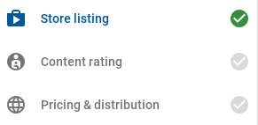
This shows you have completed the listing details and still need to fill out the content rating form as well as pricing and distribution. Although before you can do that you need to put out an app release.
App Releases
Click on App release in the sidebar. You should see a list of tracks for various testing phases. Click on MANAGE in the production track. Then click CREATE RELEASE.
You’ll see a message about using App signing by Google Play. This is a new feature which puts the managing of keys into Google’s hands. The reason you’d want this is simple: if you manage your own keys and you lose them you will no longer be able to release updates for your app. In fact, you’d have to create a new one under a new name! However, note that this is an option. Here you’ll be using it. For that, you will need to generate an upload key.
- Open your app in Android Studio by browsing to the
androidfolder of your React Native project - Go to Build > Generate signed bundle / APK
- Select APK and click Next
- Under Key store path click Create new
- Choose a path like
/home/karl/keystores/android.jks - Choose passwords for the keystore and key
- Enter the certificate information (note: this won’t be displayed in the app, just the certificate)
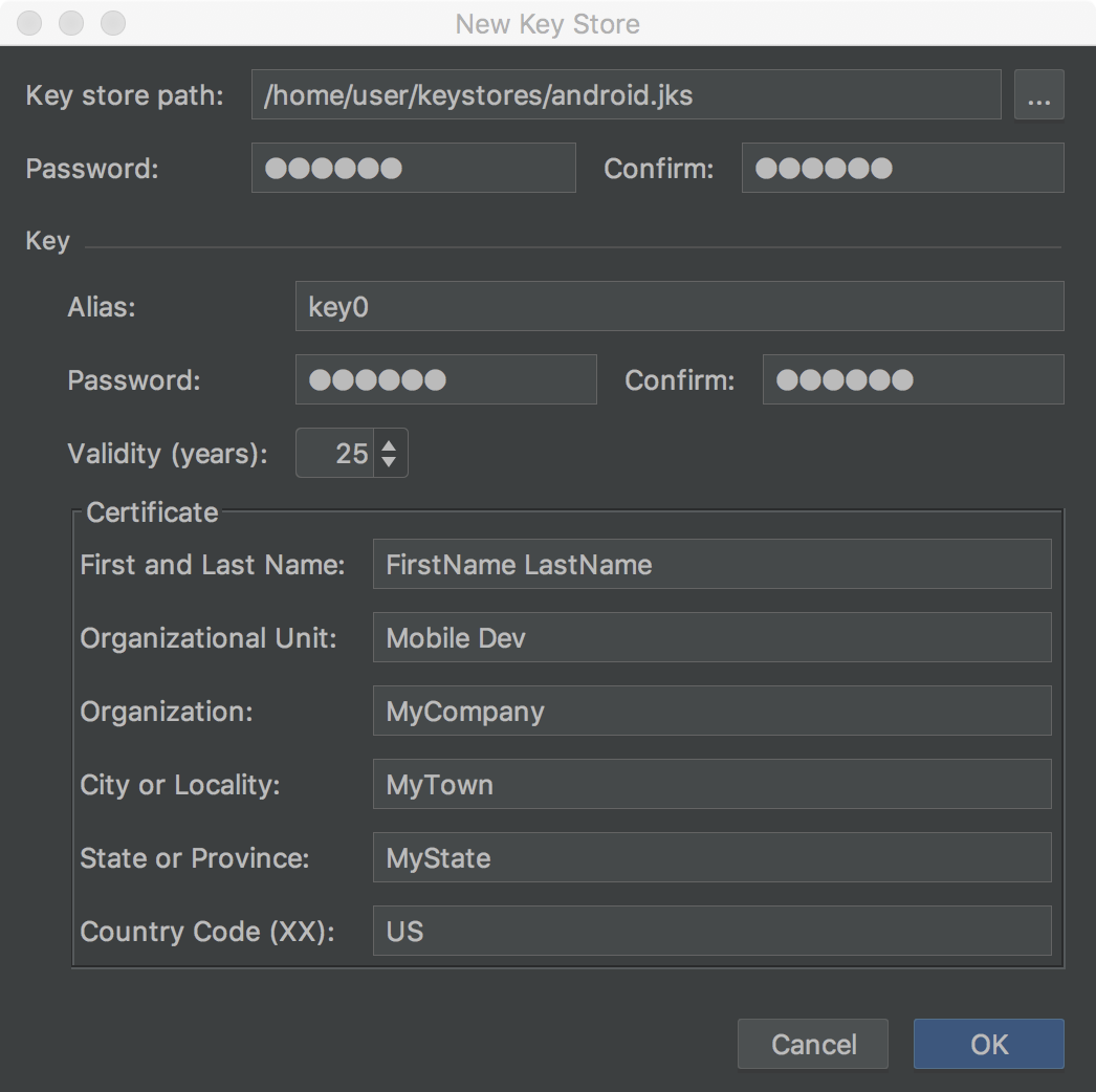
Click OK and click Next. Select both the V1 and the V2 signature version and click Finish. A build should start after which you should see both app-x86-release.apk and app-armeabi-v7a-release.apk inside of android/app/release in your project (one for each device architecture).
If you try upload these apps now you will get an error saying “Your app is using permissions that require a privacy policy”. This is because React Native adds app permissions behind the scenes. To force them to not be included you must first add xmlns:tools="http://schemas.android.com/tools" to the manifest element of android/app/src/main/AndroidManifest.xml and then add the following (see the previous link for more):
<uses-permission tools:node="remove" android:name="android.permission.READ_PHONE_STATE" />
<uses-permission tools:node="remove" android:name="android.permission.WRITE_EXTERNAL_STORAGE" />
<uses-permission tools:node="remove" android:name="android.permission.READ_EXTERNAL_STORAGE" />
You can also remove the alert window and internet uses-permission since we’re not using them. Re-build and re-upload. Put in some release notes and click SAVE.
Content Rating
Now with the release made you can enter in rating information. Go to Content rating in the sidebar, read the message about IARC and click CONTINUE.
For type, click Utility at the bottom. Then a questionnaire will show. You can click No for all the fields. Click SAVE QUESTIONNAIRE. After this, you can click CALCULATE RATING. You will see a list of how your app will be rated. Scroll to the bottom and click APPLY RATING.
That should put a tick next to Content rating. The only thing left is pricing and distribution.
Pricing & Distribution
This section should also be straight-forward since you are not charging for your app. Simply select the Available button at the top of the country columns to select all 143 countries as available. Then select no for child-directed and contains ads. Then check the Content Guidelines and US export laws checkboxes and click SAVE DRAFT.
At the top of the Play console, it should say Ready to publish.
Releasing Your Android App
Go to App release and click EDIT RELEASE. Scroll to the bottom and click REVIEW. Click on START ROLL-OUT TO PRODUCTION. Click Confirm. Your app should now say Pending publication at the top. You now need to wait a few hours for Google to check your app before releasing it.
NOTE: It might be worthwhile using a testing release first to make sure everything works before you release to production, i.e. to everyone!
Learn More About Android, React Native, and Secure User Management
Congrats! You have just finished choosing, designing, and developing an Android app using React Native, as well as publishing it to the Play Store. I hope you found this tutorial enlightening. Go and make something useful and publish it!
You can find the app built in this blog post on the Google Play Store. The app’s source code is available on GitHub.
If you’re interested in learning more about app design, React Native or secure user management with Okta, check out the following resources:
- Create a React Native App with Login in 10 Minutes
- Android Login Made Easy with OIDC
- Create a Basic Android App without an IDE
- Build and Test a React Native App with TypeScript and OAuth 2.0
Like what you learned today? Follow us on Twitter, like us on Facebook, check us out on LinkedIn, and subscribe to our YouTube channel.
Okta Developer Blog Comment Policy
We welcome relevant and respectful comments. Off-topic comments may be removed.