Build a React App with ANT Design Principles

For years the go-to HTML/CSS framework of choice for developers was Bootstrap. A new contender has appeared in the form of Ant Design. Ant should feel familiar to veteran developers but it’s built on new principles. Their site spends a good amount of effort distinguishing between good and bad design. There is an emphasis on clarity and meaning. Ant Design is heavily based on psychological principles to anticipate—and be customized for—user behavior.
Ant Design is built for React. In this tutorial, you will build a small React app that displays transactions to the user based on the Ant Design principles. You will use Okta to secure your web application. Okta is very easy to set up and using the libraries for integrating into React is simple. You will learn how to secure your app with Okta and how to put certain pages under authentication.
Note: In May 2025, the Okta Integrator Free Plan replaced Okta Developer Edition Accounts, and the Okta CLI was deprecated.
We preserved this post for reference, but the instructions no longer work exactly as written. Replace the Okta CLI commands by manually configuring Okta following the instructions in our Developer Documentation.
What is Ant Design?
Ant Design principles were developed for Ali Baba. Ali Baba is one of the largest companies in the world who’s B2B E-Commerce site is the backbone of a multinational Chinese corporation. Ant Design of React is a set of React components using the Ant Design principles.
It’s virtually impossible to cover all of Ant’s concepts in one article but I’ll attempt to give you a high-level look. Ant aims to be natural, clear, and concise in the presentation of material. It relies on natural user cognition and natural user behavior to dictate where elements are most likely to be seen and how to enable users to quickly identify what type of information they are being shown. Ant is designed to allow for growth in your website as your company and/or line of business grows with it. Ant focuses on developer certainty, rather than relying on what component to use. Ant attempts to guide the developer to user-specific components for a task. Ant is also designed around the concept of helping users achieve their mission. To do this, Ant is focused on providing clear feedback to the user if they are on the right path.
Ant provides many common components you will need to develop any website. This includes the basics like tables and forms, down to alerts, calendars, and tabs. You can also upgrade to a professional license and get access to graphs, charts, dashboards, and much more. Ant also provides several templates along with an online editor to rapidly prototype your site’s design.
Set Up Your Okta Application
Okta aims to make its SSO service as simple as possible for developers. They have taken on most of the middleware logic with their suite of packages for React.
Before you begin, you’ll need a free Okta developer account. Install the Okta CLI and run okta register to sign up for a new account. If you already have an account, run okta login.
Then, run okta apps create. Select the default app name, or change it as you see fit.
Choose Single-Page App and press Enter.
Use http://localhost:3000/login/callback for the Redirect URI and accept the default Logout Redirect URI of http://localhost:3000/login.
What does the Okta CLI do?
The Okta CLI will create an OIDC Single-Page App in your Okta Org. It will add the redirect URIs you specified and grant access to the Everyone group. It will also add a trusted origin for http://localhost:3000/login. You will see output like the following when it’s finished:
Okta application configuration:
Issuer:    https://dev-133337.okta.com/oauth2/default
Client ID: 0oab8eb55Kb9jdMIr5d6
NOTE: You can also use the Okta Admin Console to create your app. See Create a React App for more information.
Create Your React Application
As this application will be in react you can use the create-react-app toolchain to quickly scaffold your app. To do this open the folder where your application will be and run:
npx create-react-app transactions
It takes a moment but after it’s complete you can use cd transactions to switch to your new React app.
You’ll need to get a couple of packages from npm. First is the Ant Design of React package that contains the components based on Ant Design.
npm i antd@4.3.3
Next, you will need to get Okta’s React library to help manage your authentication.
npm i @okta/okta-react@3.0.2
You’ll also need the React Router package for the web from npm.
npm i react-router-dom@5.2.0
Finally, you will want to use dotenv to store your sensitive values in the .env file. This file can be added to your .gitignore.
npm i dotenv@8.2.0
After dotenv is completed you can add a new file to your root directory called .env. Add the following code to it. REACT_APP_OKTA_URL_BASE is the same that you use to log in to create your application. You can get the values for REACT_APP_OKTA_CLIENTID and REACT_APP_OKTA_URL_BASE from the app you created earlier.
REACT_APP_OKTA_CLIENTID={yourClientId}
REACT_APP_OKTA_URL_BASE={yourOktaDomain}
REACT_APP_OKTA_APP_BASE_URL=http://localhost:3000
NOTE: You can run okta apps to see your Okta OIDC applications and okta apps config --app=<app-id> to get a specific app’s configuration.
Add Your React Components
The basic setup is done and it’s time to start putting Ant Design of React to work. Add a new folder in your src directory called Components. In this folder add a new file called LoginForm.jsx. Add the following code.
import React, { useState } from 'react';
import OktaAuth from '@okta/okta-auth-js';
import { useOktaAuth } from '@okta/okta-react';

import { Form, Input, Button, Alert, Row, Col } from 'antd';

const LoginForm = ({ baseUrl, issuer }) => {

  const { authService } = useOktaAuth();
  const [sessionToken, setSessionToken] = useState();
  const [username, setUsername] = useState();
  const [password, setPassword] = useState();
  const [error, setError] = useState();

  const handleSubmit = (e) => {
    e.preventDefault();

    const oktaAuth = new OktaAuth({ url: baseUrl, issuer: issuer });
    oktaAuth.signIn({ username, password })
      .then(res => setSessionToken(res.sessionToken))
      .catch(err => setError(err));
  };

  const layout = {
    labelCol: { span: 8 },
    wrapperCol: { span: 8 },
  };

  const tailLayout = {
    wrapperCol: { offset: 8, span: 16 },
  };

  const handleUsernameChange = (e) => {
    setUsername(e.target.value);
  };

  const handlePasswordChange = (e) => {
    setPassword(e.target.value);
  };

  if (sessionToken) {
    authService.redirect({ sessionToken });
    return null;
  }

  const errorAlert = error ? <Row>
    <Col span="8"></Col>
    <Col span="8">
      <Alert message="Authentication Failed" type="warning"></Alert>
    </Col>
  </Row> : ''

  return (
    <Form
      {...layout}
      onSubmit={handleSubmit}
    >

      <Row>
        <Col span="8"></Col>
        <Col span="8"><p>Please Login with your Okta Account</p></Col>
      </Row>

      <Form.Item
        label="Username"
        name="username"
        value={username}
        onChange={handleUsernameChange}
        rules={[{ required: true, message: 'Please input your username!' }]}
      >
        <Input />
      </Form.Item>

      <Form.Item
        label="Password"
        name="password"
        value={password}
        onChange={handlePasswordChange}
        rules={[{ required: true, message: 'Please input your password!' }]}
      >
        <Input.Password />
      </Form.Item>

      <Form.Item {...tailLayout}>
        <Button type="primary" htmlType="submit" onClick={handleSubmit}>
          Login
        </Button>
      </Form.Item>

      { errorAlert }

    </Form>
  );
};
export default LoginForm;
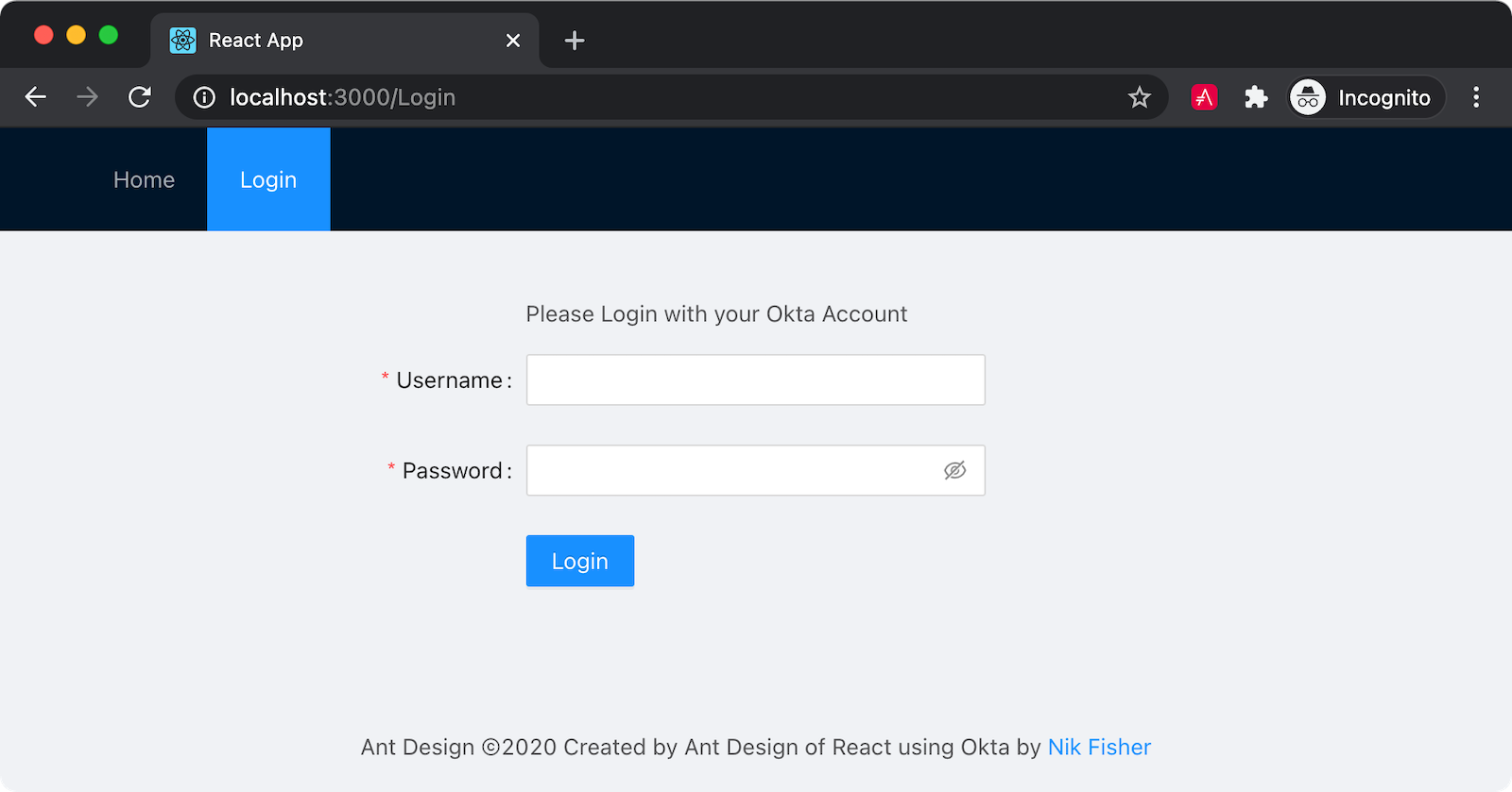
This component is a basic login form with username and password fields along with a button and some validation. You can see that your components are imported from the Ant library. Rows and Cols are fairly self-explanatory. One note is that Ant uses a 24-cell grid rather than the 12-cell grid you may be used to from Bootstrap. The form component here has some layout options and an override for the submit. You are tying into the submission to use Okta’s React package for authentication. Ant also provides Form.Item components. These components can have their own validation rules right on the component. Finally, you have an Alert component that will flash a simple validation message if the authentication fails.
Next, you can add a new file in Components called SiteHeader.jsx. The code follows.
import React from 'react';
import { useOktaAuth } from '@okta/okta-react';
import { Layout, Menu } from 'antd'

const { Header } = Layout;

const SiteHeader = (props) => {
  const {authState, authService} = useOktaAuth();

  if (authState.isAuthenticated) {
    return (
      <Header>
        <div className="logo"/>
        <Menu theme="dark" mode="horizontal" defaultSelectedKeys={[props.selectedKey]}>
          <Menu.Item key="dashboard">Dashboard</Menu.Item>
          <Menu.Item key="logout" onClick={() => {
            authService.logout()
          }}>Logout</Menu.Item>
        </Menu>
      </Header>
    );
  } else {
    return (
      <Header>
        <div className="logo"/>
        <Menu theme="dark" mode="horizontal" defaultSelectedKeys={[props.selectedKey]}>
          <Menu.Item key="home"><a href="/">Home</a></Menu.Item>
          <Menu.Item key="login"><a href="/Login">Login</a></Menu.Item>
        </Menu>
      </Header>
    );
  }
};
export default SiteHeader;
To avoid a naming conflict with the Header component from antd, this component is called SiteHeader. This component will be placed at the top of each of your pages. The component uses Okta to check the authState and chooses which menu to show. Here is your first exposure to the Menu component provided by Ant. You are passing a selectedKey into the props of this component to set the defaultSelectedKeys. This property will highlight the selected menu item to make it clear to the user what page they are on.
Finally, add a new component called SiteFooter.jsx. Add the following code to it:
import React from 'react';
import { Layout } from 'antd';

const { Footer } = Layout;

const SiteFooter = (props) => {
  return (
    <Footer style={{textAlign: 'center'}}>Ant Design ©2020 Created with Ant Design of React using Okta by <a
      target="_blank" href="https://profile.fishbowlllc.com">Nik Fisher</a></Footer>
  );

}

export default SiteFooter;
Create Your Pages
Now you can use these components to help build your pages. Create a new folder in your src directory called Pages. Add a new file for Home.jsx first.
import React from 'react';
import { Redirect } from 'react-router-dom';
import { useOktaAuth } from '@okta/okta-react';
import SiteHeader from '../Components/SiteHeader'
import SiteFooter from '../Components/SiteFooter';
import { Layout, Row, Col, Card } from 'antd';
import { SearchOutlined } from '@ant-design/icons';

const Home = () => {

  const { authState } = useOktaAuth();
  const { Content } = Layout;
  const { Meta } = Card;

  return (authState.isAuthenticated ?
    <Redirect to={{ pathname: '/Dashboard' }} /> :

    <Layout>
      <SiteHeader selectedKey='home'> </SiteHeader>
      <Content>
        <Row style={{ padding: 20 }}>
          <Col span="4"></Col>
          <Col span="4"></Col>
        </Row>

        <Row style={{ padding: 20 }}>
          <Col span="4"></Col>
          <Col style={{ padding: 10 }} span="4">

            <Card
              cover={
                <img
                  alt="Okta"
                  src="https://www.okta.com/sites/all/themes/Okta/images/blog/Logos/Okta_Logo_BrightBlue_Medium.png"
                  height="100px"
                />
              }
              actions={[
                <a href="https://www.okta.com" target="_blank"> <SearchOutlined key="ellipsis" /></a>
              ]}
            >

              <Meta title="Okta"/>
            </Card>
          </Col>

          <Col style={{ padding: 10 }} span="4">

            <Card
              cover={
                <img
                  alt="Ant.Design"
                  src="https://gw.alipayobjects.com/zos/rmsportal/KDpgvguMpGfqaHPjicRK.svg"
                  height="100px"
                />
              }
              actions={[
                <a href="https://ant.design/" target="_blank"> <SearchOutlined key="ellipsis" /></a>
              ]}
            >

              <Meta title="Ant.Design"/>

            </Card>
          </Col>

          <Col style={{ padding: 10 }} span="4">

            <Card
              cover={
                <img
                  alt="React"
                  src="https://upload.wikimedia.org/wikipedia/commons/a/a7/React-icon.svg"
                  height="100px"

                />
              }
              actions={[
                <a href="https://reactjs.org/" target="_blank"> <SearchOutlined key="ellipsis" /></a>
              ]}
            >

              <Meta title="React"/>

            </Card>
          </Col>

          <Col style={{ padding: 10 }} span="4">

            <Card
              cover={
                <img
                  alt="Fishbowl"
                  src="https://fishbowlllc.com/images/logo_web.png"
                  height="100px"
                  width="50px"
                />
              }
              actions={[
                <a href="https://profile.fishbowlllc.com/" target="_blank"> <SearchOutlined key="ellipsis" /></a>
              ]}
            >

              <Meta title="Fishbowl Software"/>

           </Card>
          </Col>
        </Row>
      </Content>

      <SiteFooter></SiteFooter>
    </Layout>
  );
};
export default Home;
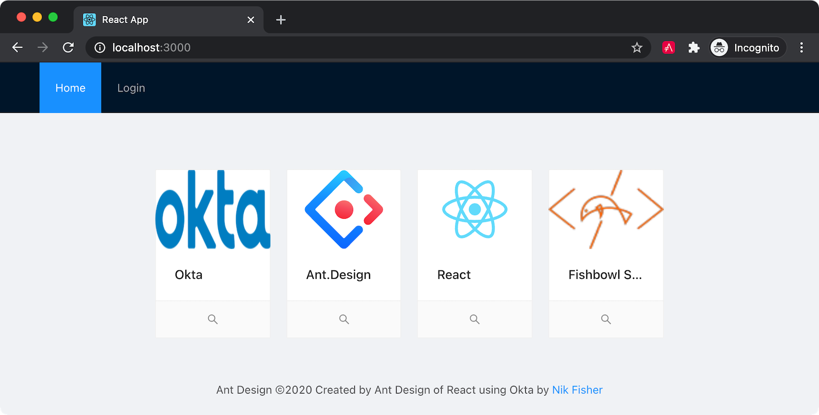
Here you see the usage of the selectedKey property on the SiteHeader. As you’ll recall this property will be set on the defaultSelectedKeys property of the Menu component. You are also checking the authState here and redirecting the user to their dashboard page if they are already logged in.
You can also see the Layout and Content section. Ant Design provides many well-designed examples for the basic layout of your page. The home page (and the login page) will have a simple Header/Content/Footer layout.
Next, you can add the Login.jsx page which will make use of your LoginForm component.
import React from 'react';
import { Redirect } from 'react-router-dom';
import LoginForm from '../Components/LoginForm'
import { useOktaAuth } from '@okta/okta-react';
import SiteHeader from '../Components/SiteHeader';
import SiteFooter from '../Components/SiteFooter';
import { Layout } from 'antd';

const { Content } = Layout;

const Login = ({ baseUrl, issuer }) => {
  const { authState } = useOktaAuth();

  if (authState.isPending) {
    return <div>Loading...</div>;
  }
  return authState.isAuthenticated ?
    <Redirect to={{ pathname: '/Dashboard' }} /> :
    <Layout>
      <SiteHeader selectedKey="login"></SiteHeader>
      <Content style={{ padding: 40 }}>
        <LoginForm baseUrl={baseUrl} issuer={issuer} />
      </Content>

      <SiteFooter></SiteFooter>
    </Layout>
};

export default Login;
Again you are passing the selectedKey value of login to the SiteHeader component. This page also checks an authenticated user and moves the user to the Dashboard page.
Finally, add Dashboard.jsx to your Pages folder and add the following code.
import React, { Component } from 'react';
import SiteHeader from '../Components/SiteHeader';
import SiteFooter from '../Components/SiteFooter'
import { Layout, Breadcrumb, Menu, Anchor, Table, Tag, Row, Col } from 'antd';
import { UserOutlined } from '@ant-design/icons';
const { Content, Header, Sider } = Layout;
const { SubMenu } = Menu;
const { Link } = Anchor

class Dashboard extends Component {

  constructor(props, context) {
    super(props, context);

    const accounts = [
      {
        id: 1,
        name: 'Checking',
        transactions: [
          {
            id: 1,
            amount: -100.00,
            type: 'debit',
            tags: [
              'groceries'
            ]
          },
          {
            id: 2,
            amount: 2000.00,
            type: 'credit',
            tags: [
              'payroll'
            ]
          },
          {
            id: 3,
            amount: -50.00,
            type: 'debit',
            tags: [
              'credit card',
              'bills'
            ]
          },
          {
            id: 4,
            amount: -300.00,
            type: 'debit',
            tags: [
              'car',
              'bills'
            ]
          },
          {
            id: 5,
            amount: -1000.00,
            type: 'transfer out',
            tags: [
              'savings'
            ]
          },
          {
            id: 5,
            amount: -1000.00,
            type: 'transfer out',
            tags: [
              'mm account'
            ]
          }
        ]
      },
      {
        id: 2,
        name: 'Savings',
        transactions: [
          {
            id: 1,
            amount: 1000.00,
            type: 'transfer in',
            tags: [
              'savings'
            ]
          }
        ]
      },
      {
        id: 3,
        name: 'Mutual Market',
        transactions: [
          {
            id: 1,
            amount: 1000.00,
            type: 'transfer in',
            tags: [
              'groceries'
            ]
          }
        ]
      },
    ]

    var selectedAccount = {};
    if (this.props.account) {
      selectedAccount = this.state.accounts.filter(account => account.id == this.props.account)[0];
    }
    else {
      selectedAccount = accounts[0]
    }

    this.state = {
      selectedAccount: selectedAccount,
      accounts: accounts,
      viewingTransactions: false
    }
  }

  changeDashboard = (e) => {
    var key = e.key;
    this.setState({ selectedAccount: this.state.accounts.filter(account => account.id == key)[0] });
  }

  render() {
    const columns = [
      {
        title: 'Type',
        dataIndex: 'type',
        key: 'type',
      },
      {
        title: 'Amount',
        dataIndex: 'amount',
        key: 'amount',
        sorter: {
          compare: (a, b) => a.amount - b.amount
        },
      },
      {
        title: 'Tags',
        dataIndex: 'tags',
        key: 'tags',
        render: tags => {
          return tags.map(tag => {
            return (<Tag color="blue" key={tag}>
              {tag}
            </Tag>);
          })
        }
      },
    ];

    var table = this.state.selectedAccount.transactions ? <Table dataSource={this.state.selectedAccount.transactions} columns={columns}></Table> : ''

    return (
      <Layout style={{ minHeight: "100vh" }}>
        <Sider collapsible>

          <div style={{ height: "32px", margin: "16px" }}></div>
          <Menu defaultOpenKeys={['accounts']} defaultSelectedKeys={[this.state.selectedAccount.id ? this.state.selectedAccount.id.toString() : '']} theme="dark" mode="inline">
            <SubMenu key="accounts" icon={<UserOutlined />} title="Accounts">
              {
                this.state.accounts.map((account, i) => {
                  return <Menu.Item onClick={(e) => this.changeDashboard(e)} key={account.id}>{account.name}</Menu.Item>
                })
              }
            </SubMenu>
          </Menu>
        </Sider>
        <Layout className="site-layout">
          <SiteHeader />
          <Content style={{ margin: '0 16px' }}>
            <Breadcrumb style={{ margin: '16px 0' }}>
              <Breadcrumb.Item>
                <a href="Dashboard">Dashboard</a>

              </Breadcrumb.Item>
            </Breadcrumb>

            <Row>
              <Col>
                <h2>{this.state.selectedAccount.name}</h2>
              </Col>
            </Row>
            <Row>
              <Col span="4"></Col>
              <Col span="16">{table}</Col>
              <Col span="4"></Col>
            </Row>
          </Content>

          <SiteFooter></SiteFooter>
        </Layout>
      </Layout >
    );
  }
};
export default Dashboard;
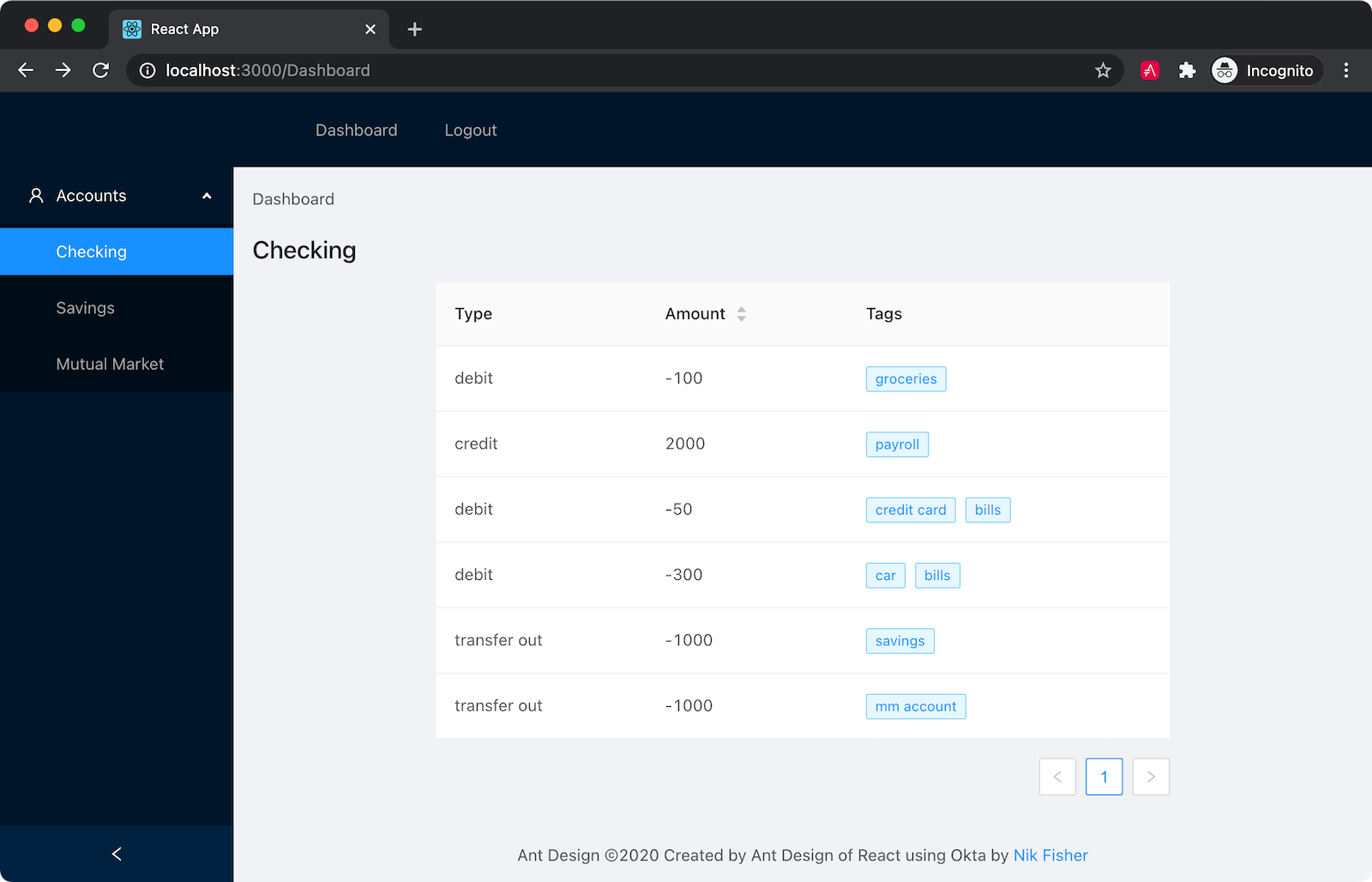
The layout here is a little more exotic. You are adding a sidebar menu, called a Sider in Ant Design, that will contain the user’s accounts. You can see at the top of this file you added some sample data to display on this page. There are three accounts. Of course, the Sider menu also accepts defaultSelectedKeys which you are setting to the first account unless a specific account is passed into this page. The Sider is collapsible, providing a collapse button on the bottom of the menu. The Breadcrumb navigation can help users navigate on more complex web structures. This app is simple enough that the breadcrumbs are mostly for show, but they can be instrumental if your users are going to navigate down multiple paths.
You’ll see here you are also using the Row/Col paradigm that you are likely familiar with. In keeping with the 24-grid system, your column spans add up to 24, although the last column isn’t necessary. Finally, you are making use of the Table component provided by Ant Design of React. The table accepts a data source and some column definitions and uses these to generate a table for you. No more loops or maps in your code. The column definitions are very robust. In this example, you are presenting the user with some tags that describe the transactions. Because these tags are in an array you need to use the render function on the column definition to tell Ant what to do with this. In this case, you are creating a Tag for each tag in your array. A sorter on your Amount column allows the user to sort by the transaction amount.
Set up your App.js
Finally, you will need to define your routes and set up your App.js file. First, add a new file to the src folder called AppWithRouterAccess.jsx and add the following code.
import React from 'react';
import { Route, useHistory } from 'react-router-dom';
import { LoginCallback, SecureRoute, Security } from '@okta/okta-react';
import Home from './Pages/Home'
import Dashboard from './Pages/Dashboard'
import Login from './Pages/Login'

const AppWithRouterAccess = () => {
  const history = useHistory();
  const onAuthRequired = () => {
    history.push('/login');
  };

  const baseDomain = process.env.REACT_APP_OKTA_URL_BASE;
  const issuer = baseDomain + '/oauth2/default'
  const clientId = process.env.REACT_APP_OKTA_CLIENTID;
  const redirect = process.env.REACT_APP_OKTA_APP_BASE_URL + '/login/callback';

  return (
    <Security issuer={issuer}
              clientId={clientId}
              redirectUri={redirect}
              onAuthRequired={onAuthRequired}
              pkce={true}>
      <Route path='/' exact={true} component={Home}/>
      <Route path='/login' render={() => <Login baseUrl={baseDomain} issuer={issuer}/>}/>
      <SecureRoute path='/Dashboard' exact={true} component={Dashboard}/>
      <Route path='/login/callback' component={LoginCallback}/>
    </Security>
  );
};

export default AppWithRouterAccess;
This is where you tie together the magic of Okta. By defining Dashboard as a SecureRoute to ensure that the application will check for authentication before allowing the user to process. The function onAuthRequest() is passed into the Security component and moves the user to the Login page if the user isn’t authenticated. The rest of the routes are defined here as well, including one for /login/callback which Okta will use when returning user information to your application.
You need to make your App.js show the application rather than the boilerplate react page.
import React from 'react';
import { BrowserRouter as Router } from 'react-router-dom';
import AppWithRouterAccess from './AppWithRouterAccess';
import './App.css'

const App = () => {
  return (
    <Router>
      <AppWithRouterAccess/>
    </Router>
  );
}

export default App;
And finally, you will need to import the Ant Design CSS. To do this, open your App.css file and add the line @import '~antd/dist/antd.css'; to the top of the file.
Run and Test
Your application is now complete. In the terminal run the command npm start and see the results. You should be presented with the Home page.

From here you can click on Login and use your Okta credentials to log in.

Afterward, you will be directed to the dashboard page.

Honestly, there is far more to Ant Design than what you have read here. One could take an entire course on the subject. But Ant can help developers understand what components they should be using and why. The principles developed of studies of human behavior can streamline the design process and make developers certain of which tools to use. I encourage you to try a couple of projects in Ant Design and take the time to learn the principles. In the long run, the knowledge and experience will make you that much better.
Learn More About JavaScript and React
If you’d like the final version of this code, you can clone it from GitHub. If you have questions about this post, please post them to the comments below. If you have questions about Okta, please submit them to the Okta Developer Forum. If you enjoyed this post, you might also enjoy these related posts:
- Build Your First Deno App with Authentication
- Build a Simple React Application Using Hooks
- How to Use CSS Grid to Build a Responsive React App
Also, don’t forget to follow us on Twitter and subscribe to our YouTube Channel!
Changelog:
- Apr 13, 2021: Updated to streamline setup with the Okta CLI and add to add screenshots. okta-blog#706 shows what changed.
Okta Developer Blog Comment Policy
We welcome relevant and respectful comments. Off-topic comments may be removed.